-
Appspand Client:
Spendsafe, a smart, safe, and easy money app designed to help families manage kids' money, build strong habits, and teach real financial literacy. -
Graphic Designer
-
ASO graphics
App Icon

The original app icon lacked contrast. Compared to their competitors, the fingerprint icon was unique, but the muted green made them look dull. I pulled a bright neon green from their color palette—a simple fix with large impact.
App Store Graphics
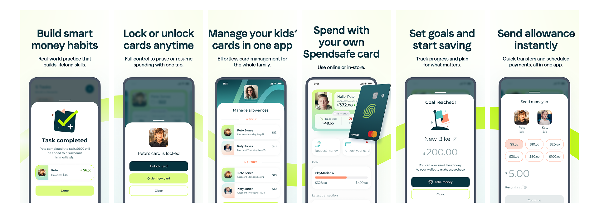
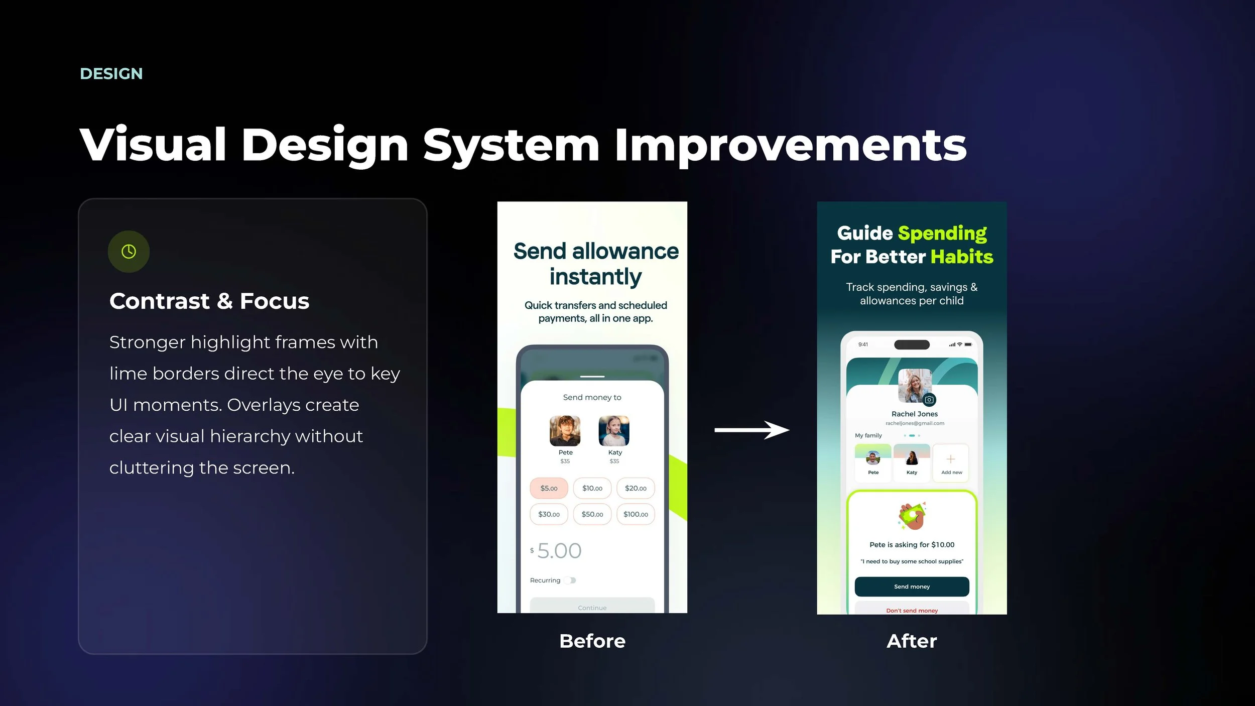
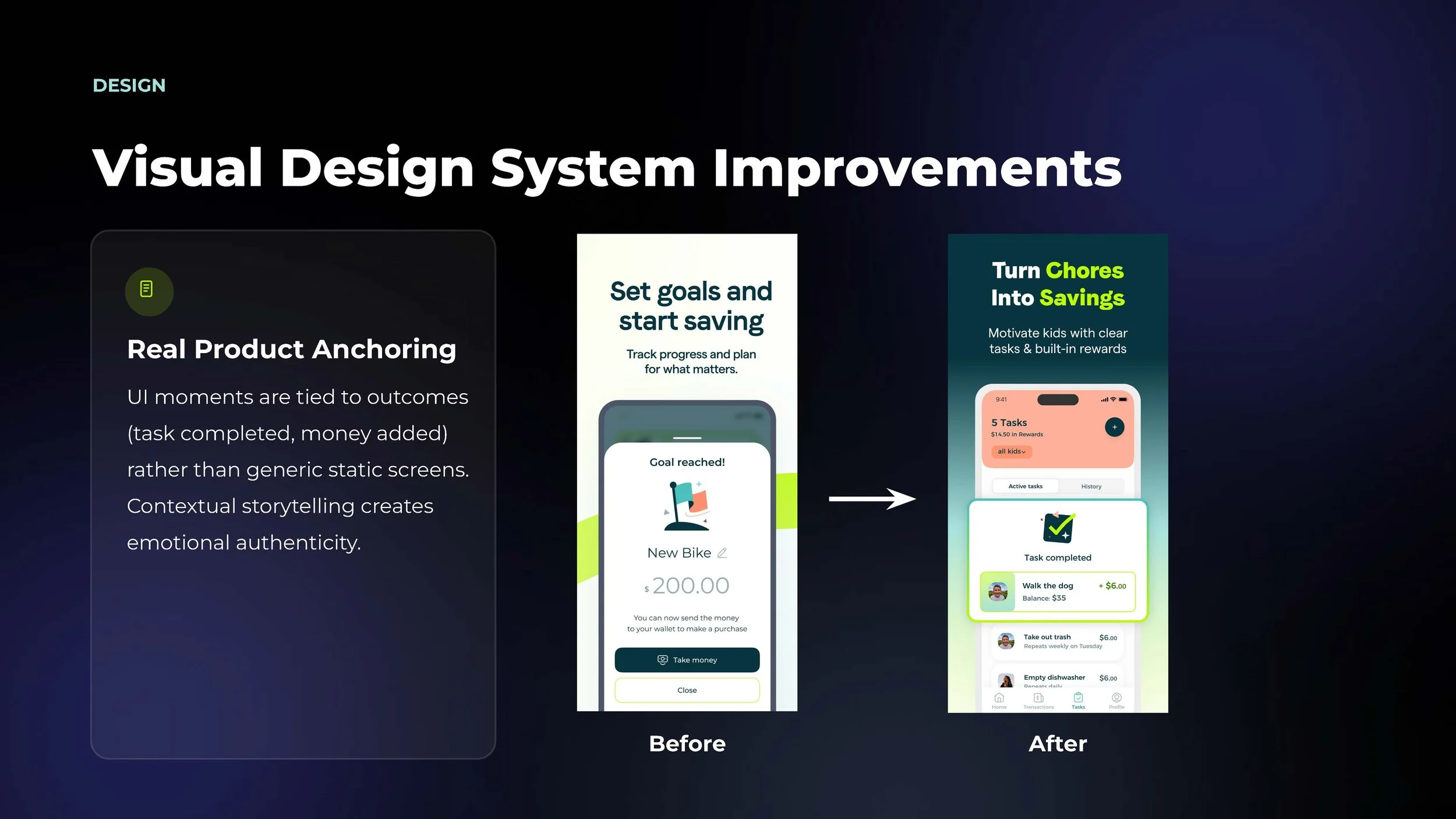
Before
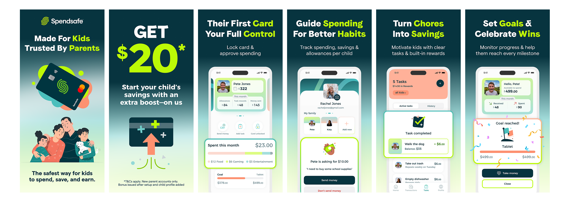
After
Feature Graphic (Google Play)